
FreeScore your brand plan before management does. Send me the scorecard
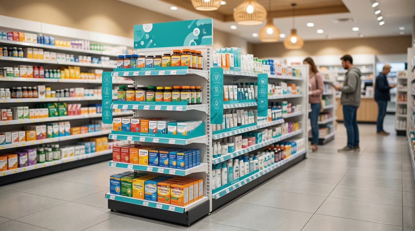
In short: a good pharmacy planogram starts from how the shopper decides, not from who supplies the products. In most pharmacy categories that means vertical blocks by need state or symptom, the most-chosen products at eye level, specialist formats higher, large and value packs lower, private label next to the brand it is compared with, and anything that needs advice kept near the pharmacist. The eight examples below apply that logic to pain relief, cough and cold, vitamins, skin care, baby care, oral care, digestive health and first aid. A copyable template follows them.
Most people looking for planogram examples want to see a shelf drawn out, not another definition. This article gives eight worked examples for the categories every pharmacy carries, each drawn as a shelf-by-shelf table with the reasoning that produced it. You can copy the logic even if your fixture, range or brands are different.
If you need the full method first (what a planogram is, how to gather data, how to build one and get it approved), start with the main guide to the pharmacy planogram. This page is its practical companion: fewer principles, more shelves.
How Should You Read These Planogram Examples?
Short answer: each example is a grid. Columns are the blocks a shopper scans across the bay; rows are shelves from top to bottom; each cell names a fictional product and its number of facings. The text around each table explains why the grid looks the way it does.
Every brand name in this article is fictional: “Brand A”, “Brand B” and so on, plus “private label” for a pharmacy’s own brand. The fixtures, ranges and facing counts are invented for illustration and do not describe any real store, chain or supplier. Use them to see the logic, then replace them with your own range and your own sales data.
A few conventions apply to all eight tables:
- Shelf levels. Five shelves, named top, upper eye level, eye level, waist and bottom. Your fixture may have four or six; merge or split the rows.
- Blocks. Each column is one block. In a vertical layout the block runs from top to bottom, so a shopper who has found “dry cough” sees every option for it in one column.
- Facings. The number in brackets after each product is its facings: how many units sit side by side at the front of the shelf. The counts are illustrative; in practice they come from rate of sale and how often the shelf is refilled.
- Products that need advice. Where a category contains medicines that your rules restrict to pharmacist supply, they are taken off the open shelf and listed in the notes under the table.
What Makes a Good Planogram Example for Pharmacy?
Short answer: four choices, made in order: the shopper decision tree, the blocking direction, the eye-level priority, and the place of private label and advice products. A layout that skips the first choice usually ends up arranged by supplier, which suits the people who stock the shelf rather than the people who shop it.
A pharmacy shelf is different from a supermarket shelf. Many shoppers arrive with a symptom and little product knowledge, some will ask the pharmacist before they choose, and part of the range is medicine with its own rules. That makes the decision tree (the order in which a shopper narrows down the choice) the starting point for every planogram. The guide to category management in pharmacy explains how a decision tree is built from shopper research; here we use it.
Vertical or horizontal blocking?
Once you know the first thing a shopper looks for, you can decide how to block the shelf. The two basic options behave differently:
| Blocking | What it looks like | When it fits | Pharmacy categories where it often fits |
|---|---|---|---|
| Vertical by need state | Each need or symptom gets a column from top to bottom | Shoppers choose the need first, then the product | Pain relief, cough and cold, digestive health, vitamins, first aid |
| Vertical by brand | Each brand range gets a column from top to bottom | Shoppers are loyal to a range and buy several steps of it | Dermocosmetic skin care, some baby care ranges |
| Horizontal by brand | Each brand gets a shelf, running across the bay | Shoppers compare brands within one product type | Toothpaste within a need column, some supplement ranges |
| Mixed | Need-state columns across the bay, brand bands inside each column | Need comes first, but brand matters within it | Oral care, skin care in smaller pharmacies |
Vertical blocks have one practical advantage in a pharmacy: they give every block access to eye level. A horizontal layout gives eye level to one brand or one segment and pushes the rest up or down. For more on shelf heights, adjacency and point-of-sale material, see the guide to pharmacy merchandising strategies.
Example 1: How Do You Lay Out a Pain Relief Shelf?
Short answer: block vertically by need state (headache and general pain, oral muscle and joint, topical muscle and joint, children’s pain and fever), keep the most-asked-for adult and children’s products at eye level, and place private label beside the brand it is compared with.
How shoppers decide. The typical decision tree runs: who is it for (adult or child), then where the pain is (head, muscles and joints, or fever in a child), then the form (tablet, capsule, soluble, syrup, gel, patch), then brand or price. Many shoppers ask the pharmacist to recommend an active ingredient, so the shelf must make that recommendation easy to find.
| Shelf | Headache and general pain | Muscle and joint (oral) | Muscle and joint (topical) | Children's pain and fever |
|---|---|---|---|---|
| Top | Brand C specialist formats (soluble, fast-release) (1 each) | Brand E combination pack (1) | Heat patches and wraps (1 each) | Infant drops (Brand A) (1) |
| Upper eye level | Brand A tablets, small pack (3) | Brand B tablets (2) | Brand D gel, small tube (2) | Brand A children's syrup (3) |
| Eye level | Brand A capsules (3); Brand B tablets (2) | Brand D tablets (2) | Brand B gel (2); Brand D spray (1) | Brand B children's syrup (2) |
| Waist | Private label tablets beside Brand A (2) | Private label equivalent (2) | Private label gel (1); cooling gel (1) | Private label children's syrup (2) |
| Bottom | Larger packs where rules allow open-shelf sale (1 each) | Value packs (1) | Large tubes (1 each) | Family packs, dosing syringes (1) |
Why it is built this way. The children’s block sits at the end of the bay, so a parent can find it without searching through adult products, and it stays in one column so the dosing devices are next to the syrups. Topical products get their own column because shoppers who want a gel are rarely persuaded to take a tablet instead. Specialist formats go on the top shelf, visible but not taking the best space from the products most people buy.
Private label. In each column the private label equivalent sits on the waist shelf, directly below the brand it copies. A shopper comparing price sees both without moving.
Near the pharmacist. Pain relief is a category where rules often differ by active ingredient and pack size. Combination products and some ingredients may be restricted to pharmacist supply, and some markets limit the pack sizes that may be sold from an open shelf. Follow current SFDA and local rules, and move anything that is restricted to the area behind the counter. The open-shelf planogram should only show what may be sold there.
Example 2: How Do You Lay Out a Cough and Cold Shelf?
Short answer: block by symptom (dry cough, chesty cough, sore throat, blocked nose, multi-symptom cold and flu), because the symptom is the shopper’s first question, and give the bay extra space in the season.
How shoppers decide. Symptom first (“a dry tickly cough” or “a chesty cough”), then who it is for, then the format (syrup, lozenge, spray, sachet, tablet), then brand or price. Confusing dry and chesty cough products is a common reason shoppers ask for help, so the shelf labels for those two blocks matter more than in most categories.
| Shelf | Dry cough | Chesty cough | Sore throat | Blocked nose | Multi-symptom cold and flu |
|---|---|---|---|---|---|
| Top | Brand F sugar-free syrup (1) | Brand G large bottle (1) | Throat spray (Brand H) (1) | Saline sprays for children (1) | Night-time formats (1) |
| Upper eye level | Brand F syrup (2) | Brand G syrup (2) | Brand H lozenges (3) | Brand J nasal spray (2) | Brand K hot drink sachets (3) |
| Eye level | Brand L syrup (2) | Brand M syrup (2) | Brand L lozenges (2) | Saline spray (Brand J) (2) | Brand K tablets (2) |
| Waist | Private label dry-cough syrup (1) | Private label chesty-cough syrup (1) | Private label lozenges (2) | Private label saline (1) | Private label sachets (2) |
| Bottom | Children's dry-cough syrup (1) | Children's chesty-cough syrup (1) | Honey and herbal lines (1 each) | Inhalation rubs, steam aids (1 each) | Value packs (1) |
Why it is built this way. Dry and chesty cough products sit side by side with a clear shelf-edge label above each block, because they look alike and do different jobs. Sore throat lozenges get the most facings at eye level in this example, since they are an impulse and a planned purchase at the same time. The multi-symptom block sits at the end of the bay, next to pain relief if the store layout allows, because shoppers with a cold often look for both.
Seasonality. A cough and cold planogram usually has two versions: an in-season layout with more facings and perhaps an extra bay or an end-cap, and an out-of-season layout that hands space back to allergy or another category. Agree the switch dates in advance so the shelf changes before demand does.
Near the pharmacist. Some cough and cold medicines contain ingredients that the rules restrict to pharmacist supply or that carry a misuse risk, and some are not suitable for young children. Check how each product is classified under current SFDA and local rules, keep restricted lines behind the counter, and keep the children’s products on the bottom shelf only if the rules allow them on open sale.
Example 3: How Do You Lay Out a Vitamins and Supplements Shelf?
Short answer: block by the need the shopper names (multivitamin, immunity, energy, bone and joint, women’s and life-stage), not by ingredient, and keep children’s products together low on the shelf where a parent can see them.
How shoppers decide. Most shoppers start with a goal (“something for my immunity”, “I feel tired”) rather than an ingredient. Then they choose who it is for, the format (tablet, capsule, effervescent, gummy, syrup), the brand and the pack size. A smaller group comes in for a single ingredient that a doctor suggested, such as vitamin D or iron, and knows exactly what they want.
| Shelf | Multivitamins | Immunity | Energy and fatigue | Bone and joint | Women's and life-stage |
|---|---|---|---|---|---|
| Top | Premium multivitamin (Brand N) (1) | Single-ingredient zinc (1) | Brand P magnesium (1) | Brand Q collagen (1) | Brand R menopause formula (1) |
| Upper eye level | Brand N adult multivitamin (3) | Brand S vitamin C effervescent (3) | Brand T B-complex (2) | Brand U vitamin D (3) | Brand R pregnancy formula (2) |
| Eye level | Brand N men's and women's packs (2 each) | Brand S vitamin C plus zinc (2) | Brand T iron formula (2) | Brand U calcium plus vitamin D (2) | Brand R women's multivitamin (2) |
| Waist | Private label multivitamin (2) | Private label vitamin C (2) | Private label B-complex (1) | Private label vitamin D (2) | Private label iron (1) |
| Bottom | Children's multivitamin gummies and syrups (2) | Children's immunity syrup (1) | Large tubs and value packs (1 each) | Joint formulas in large packs (1) | Omega-3 large packs (1) |
Why it is built this way. Need-state blocks answer the shopper’s first question, and single ingredients sit inside the need they are most often bought for: vitamin D in bone and joint, iron in energy, zinc in immunity. That helps the shopper who arrived with a goal and still lets the shopper who arrived with an ingredient find it. Multivitamins start the run because they are the broadest need and a common entry point to the category.
Private label. Supplements are a category where pharmacy own brands often compete hard, so the private label line sits on the waist shelf of every block rather than in its own section. For how pharmacies and suppliers approach own brands, see the guide to healthcare private label marketing.
Classification matters. Some products sold as vitamins are registered as medicines, others as supplements, and the claims allowed on shelf material differ. Keep shelf-edge labels to the need, not to a health claim, and follow current SFDA and local rules for any claim on shelf. For the marketing side of this category in the region, see vitamins and supplements marketing in the GCC.
Example 4: How Do You Lay Out a Dermocosmetic Skin Care Wall?
Short answer: block by skin concern, then arrange each block in routine order (cleanse, treat, moisturise, protect), so a shopper can build a routine from one column. In larger stores with strong brand loyalty, a brand-led wall is a valid alternative.
How shoppers decide. Two decision trees exist side by side. Shoppers new to the category start with their concern (dry, oily, sensitive, ageing, sun) and often ask for advice. Loyal shoppers go straight to a brand range they already use and look for the next product in it. The planogram has to serve both.
| Shelf | Dry and sensitive skin | Oily and blemish-prone skin | Sun protection | Anti-ageing | Atopic and very dry skin |
|---|---|---|---|---|---|
| Top | Brand V travel sizes and sets (1 each) | Brand W spot treatment (1) | After-sun (1) | Brand X serum refills (1) | Brand Y body balm large size (1) |
| Upper eye level | Step 1 cleanse: Brand V cleanser (2) | Step 1 cleanse: Brand W gel cleanser (2) | Face SPF high protection (Brand Z) (3) | Step 2 treat: Brand X serum (2) | Step 1 cleanse: Brand Y wash oil (2) |
| Eye level | Step 2 moisturise: Brand V cream (3) | Step 2 treat: Brand W serum (2); mattifying moisturiser (2) | Face SPF tinted and for oily skin (2 each) | Step 3 moisturise: Brand X day and night cream (2 each) | Step 2 soothe: Brand Y emollient cream (3) |
| Waist | Brand A2 alternative range (2) | Brand B2 alternative range (2) | Body sun lotion (2) | Eye cream (1) | Brand B2 emollient (2) |
| Bottom | Large body lotions (1 each) | Body wash for blemish-prone skin (1) | Children's sun protection (2) | Hand cream (1) | Large emollient pump packs (2) |
Why it is built this way. Concern blocks serve the new shopper; routine order inside each block helps them buy more than one step, which is how skin care is used. Sun protection gets its own column because it is bought by all skin types and peaks in certain months. Atopic and very dry skin sits at the end of the wall, closest to the counter in this example, because those shoppers are the most likely to want the pharmacist’s advice.
The brand-led alternative. Where a store carries few dermocosmetic ranges and each has loyal buyers, a vertical block per brand, with concern sub-blocks inside it, can work better. Choose by which question your shoppers ask first, not by supplier preference.
Private label and testers. Private label skin care usually sits on the waist shelf as an alternative within each concern. Testers, if used, belong at eye level next to the product they demonstrate, with a clear hygiene routine.
Example 5: How Do You Lay Out a Baby Care Bay?
Short answer: block by the moment in the baby’s day (bath, nappy change, skin and massage, feeding, health and comfort), keep the products parents buy most often at eye level, and keep bulky packs low.
How shoppers decide. Parents usually shop for a task (“nappy rash”, “new bottles”, “teething”), then the baby’s age, then a brand they trust. First-time parents ask for advice more than most shoppers, and trust in a brand, once formed, tends to carry across the range.
| Shelf | Bath and wash | Nappy area care | Skin and massage | Feeding accessories | Health and comfort |
|---|---|---|---|---|---|
| Top | Gift sets (Brand C2) (1) | Nappy rash cream large tube (1) | Baby oil (1) | Steriliser tablets (1) | Nasal aspirators (1) |
| Upper eye level | Brand C2 head-to-toe wash (2) | Brand D2 barrier cream (3) | Brand C2 baby lotion (2) | Brand E2 bottles (2) | Saline drops for babies (2) |
| Eye level | Brand F2 sensitive wash (2) | Brand F2 barrier cream (2) | Emollient for dry baby skin (2) | Brand E2 teats and soothers (2 each) | Teething gel or granules where permitted (1 each) |
| Waist | Private label baby wash (2) | Private label barrier cream (2) | Private label baby lotion (1) | Brand G2 feeding cups (1) | Thermometers (1) |
| Bottom | Large shampoo and bath packs (1 each) | Wipes (bulky packs) (2) | Cotton and pads (1) | Breast pads and nipple cream (1 each) | Bath thermometers (1) |
Why it is built this way. Moment-of-day blocks match how parents think about the routine. Barrier creams for nappy rash get the most facings in this example because the need is frequent. Health and comfort (saline drops, teething products, thermometers) sits at the end nearest the counter, because parents often ask about dosing and age before they buy. Wipes and bulk packs go on the bottom shelf, where heavy products are safer and easier to lift.
Near the pharmacist. Teething and other products for babies can be medicines with age limits. Check each one against current SFDA and local rules; anything that needs advice should be within the pharmacist’s reach rather than on an open shelf. Infant formula, where the pharmacy sells it, has its own rules on display and promotion in many markets, so plan it separately from this bay.
Example 6: How Do You Lay Out an Oral Care Bay?
Short answer: use a mixed layout: need-state columns (sensitivity, gum care, whitening, daily protection, mouthwash and interdental) across the bay, with brand bands running horizontally inside them, because need comes first and brand loyalty is strong.
How shoppers decide. In a pharmacy, oral care shoppers are often there for a problem (sensitive teeth, bleeding gums) that a dentist mentioned. They look for the need, then their brand, then the variant. Toothbrushes and interdental products are chosen by type and size, which needs a clear order on the shelf.
| Shelf | Sensitivity | Gum care | Whitening and stain | Daily protection | Mouthwash and interdental |
|---|---|---|---|---|---|
| Top | Brand H2 sensitivity rapid relief (1) | Brand J2 gum gel (1) | Whitening strips (Brand K2) (1) | Brand L2 enamel care (1) | Interdental brushes, sizes in order (1 each) |
| Upper eye level | Brand H2 toothpaste (3) | Brand J2 toothpaste (3) | Brand K2 toothpaste (2) | Brand L2 toothpaste (3) | Brand J2 mouthwash (2) |
| Eye level | Brand M2 toothpaste (2) | Brand M2 gum toothpaste (2) | Brand H2 whitening variant (2) | Brand M2 daily toothpaste (2) | Brand H2 mouthwash (2) |
| Waist | Soft toothbrushes (2) | Gum-care toothbrushes (2) | Private label whitening toothpaste (1) | Private label toothpaste (2) | Floss and tape (1 each) |
| Bottom | Twin and value packs (1) | Electric brush heads (1) | Children's toothpaste by age (1 each) | Children's brushes (2) | Large mouthwash bottles (1) |
Why it is built this way. Problem-led needs (sensitivity and gum care) come first in the direction of shopper flow, because they are the reason many shoppers buy oral care in a pharmacy rather than a supermarket. Within each column the leading brand sits on the upper eye-level shelf and a second brand directly below, which forms a horizontal brand band across the bay and makes brand comparison easy. Interdental brushes are arranged by size in one sequence, because a shopper who cannot find their size will leave without buying.
FreeScore your brand plan before management does. Send me the scorecard
Example 7: How Do You Lay Out a Digestive Health Shelf?
Short answer: block by symptom (heartburn and indigestion, constipation, diarrhoea and rehydration, bloating and wind, gut balance), use clear shelf-edge labels, and place rehydration where parents and travellers will find it.
How shoppers decide. Symptom first, and often with some embarrassment, so shoppers want to find the right block quickly without asking. Then the format (chewable, liquid, sachet, capsule), who it is for, and brand. Some will ask the pharmacist, especially for children or for symptoms that have lasted several days.
| Shelf | Heartburn and indigestion | Constipation | Diarrhoea and rehydration | Bloating and wind | Gut balance |
|---|---|---|---|---|---|
| Top | Brand N2 liquid, large bottle (1) | Fibre powder tub (Brand P2) (1) | Brand Q2 rehydration flavoured range (1) | Herbal teas (1) | Brand R2 premium probiotic (1) |
| Upper eye level | Brand N2 chewable tablets (3) | Brand P2 sachets (2) | Brand Q2 oral rehydration sachets (3) | Brand S2 capsules (2) | Brand R2 daily probiotic (2) |
| Eye level | Brand T2 liquid (2); Brand T2 tablets (2) | Brand U2 tablets (2) | Brand Q2 children's rehydration (2) | Brand V2 drops for infants (1) | Brand W2 probiotic for children (2) |
| Waist | Private label antacid tablets (2) | Private label fibre sachets (1) | Private label rehydration sachets (2) | Private label wind relief (1) | Private label probiotic (1) |
| Bottom | Value packs (1) | Glycerin and gentle children's products where permitted (1) | Rehydration bulk pack (1) | Peppermint products (1) | Large probiotic packs (1) |
Why it is built this way. Symptom blocks with plain labels reduce the need to ask about a sensitive problem. Heartburn comes first because it is often a repeat purchase with strong brand habits. Rehydration sits in the centre of the bay with the most facings in this example, because demand rises in hot weather, during travel and at times of fasting. Probiotics close the bay as a bridge to the vitamins and supplements fixture if the store layout puts them next to each other.
Near the pharmacist. Some digestive medicines, and some products for children, are restricted by ingredient, age or pack size. Follow current SFDA and local rules, and keep anything that needs a conversation about symptoms or duration within the pharmacist’s reach.
Example 8: How Do You Lay Out a First Aid Bay?
Short answer: block by task, in the order a shopper deals with an injury: clean the wound, cover small wounds, dress larger ones, treat burns, bites and stings, then support and strain. Keep sizes in sequence so shoppers can find the right one.
How shoppers decide. First aid is bought either in a hurry for an injury that has just happened or as a planned top-up of a home kit. Both shoppers start with the task, then the size, then the type (fabric, waterproof, children’s), and rarely with a brand.
| Shelf | Clean the wound | Cover small wounds | Dress larger wounds | Burns, bites and stings | Support and strain |
|---|---|---|---|---|---|
| Top | Brand X2 antiseptic spray (1) | Blister plasters (Brand Y2) (1) | Sterile dressing packs (1) | Insect repellent (1) | Cold and heat packs (1) |
| Upper eye level | Brand X2 antiseptic liquid (2) | Brand Z2 fabric plasters assorted (3) | Non-adherent dressings (2) | Burn gel (Brand A3) (2) | Elastic bandages by width (1 each) |
| Eye level | Antiseptic wipes (2) | Brand Z2 waterproof plasters (2); children's plasters (2) | Adhesive dressings by size (1 each) | After-bite and soothing cream (2) | Brand B3 knee and ankle supports (1 per size) |
| Waist | Saline wound wash (1) | Private label plasters (2) | Medical tape, gauze (1 each) | Private label antiseptic cream (1) | Private label supports (1 per size) |
| Bottom | Cotton wool, large packs (1) | Family plaster packs (1) | First aid kits (home, car, travel) (1 each) | Large burn dressings (1) | Slings, wrist supports (1) |
Why it is built this way. Task order follows the sequence of treating an injury, which also suits the shopper who is filling a kit and moves from left to right. Plasters get the most facings because they are the most frequent purchase. Supports and bandages are arranged by size in a strict sequence, since a shopper who cannot find a size quickly will ask for help or leave. Complete first aid kits sit on the bottom shelf because they are bulky and bought less often.
Private label. First aid is a category where many shoppers do not insist on a brand, so private label can sit at eye level in some blocks. In this example it sits on the waist shelf to keep the branded lines visible; your sales data should decide.
Pharmacy Shelf Layout Examples Compared: Which Blocking for Which Category?
Short answer: most pharmacy categories work best with vertical blocks by need state or symptom. Skin care and oral care are the main exceptions, where brand loyalty justifies a brand-led or mixed layout.
The table summarises the eight examples. Use it as a starting point for a category you have not laid out before, then test it against what your own shoppers ask for.
| Category | Shopper’s first question | Blocking | Eye-level priority | Private label | Advice and counter |
|---|---|---|---|---|---|
| Pain relief | Who is it for, and where is the pain? | Vertical by need state | Most-asked-for adult and children’s products | Beside or below the brand it copies | Restricted ingredients and pack sizes behind the counter |
| Cough and cold | What is the symptom? | Vertical by symptom | Leading syrups, lozenges, sachets | Waist shelf in each block | Restricted or misuse-risk lines behind the counter |
| Vitamins and supplements | What do I want to improve? | Vertical by need | Leading product in each need | Waist shelf in every block | Products registered as medicines follow medicine rules |
| Skin care | What is my skin concern, or which range do I use? | By concern with routine order, or by brand | Core moisturiser and treatment steps | Alternative within each concern | Atopic and sensitive skin nearest the counter |
| Baby care | What task do I need to do? | Vertical by moment of the day | Frequent needs such as barrier cream | Waist shelf in each block | Medicines with age limits within the pharmacist’s reach |
| Oral care | What is the problem, then which brand? | Mixed: need columns, brand bands | Leading brand in each need | Waist shelf, fewer blocks | Usually none; check medicated products |
| Digestive health | What is the symptom? | Vertical by symptom | Repeat-purchase leaders, rehydration | Waist shelf in each block | Restricted or children’s medicines near the pharmacist |
| First aid | What do I need to do to the injury? | Vertical by task | Plasters and the most frequent sizes | Can sit higher where brand matters less | Usually none |
Where Should Private Label Sit in a Pharmacy Planogram?
Short answer: inside the need-state block it competes in, next to or just below the brand it is compared with. A separate own-brand block is a deliberate choice for a chain that wants a visible store brand, not a default.
There are three common positions, each with a different effect:
| Position | What the shopper sees | Trade-off |
|---|---|---|
| Beside the brand, same shelf | A direct comparison of price and pack at the same height | Strongest comparison; takes eye-level space from branded lines |
| Directly below the brand | The brand first, the alternative one shelf down | Keeps eye level for the leader while keeping the comparison easy; used in most examples above |
| Separate own-brand block | A section where every product carries the store brand | Builds the store brand as a range; harder to compare within a need |
Whichever position you choose, apply it the same way in every category, so shoppers learn where to look.
What Goes Behind the Counter or Near the Pharmacist?
Short answer: whatever current SFDA and local rules restrict to pharmacist supply, plus products where a short conversation protects the shopper. The open-shelf planogram should only include what may legally be sold from an open shelf.
Every example above has a note on products near the pharmacist, because a pharmacy planogram covers two spaces: the open shelves and the area behind or next to the counter. Treat the second as a fixture with its own planogram. A few general principles hold across categories; the specific lists depend on how each product is classified, which changes over time and differs between markets:
- Start from classification, not habit. Check how each product is registered and what that allows. Do not copy the layout of another pharmacy, which may be in a different market or out of date.
- Advice products near the counter. Even where a product may be sold from an open shelf, placing products for children, sensitive skin or recurring symptoms near the pharmacist makes it easier to ask.
- Keep the counter organised by need too. The pharmacist reaches behind the counter many times a day. Need state order on those shelves saves time and reduces picking errors.
- Review when rules change. When a product’s status changes, both planograms change. Add a check of current rules to every planogram review.
This is general guidance, not legal advice. Confirm the current position with your regulatory or pharmacy compliance colleagues before you set a layout.
Planogram Template: What Fields Should It Have?
Short answer: eight fields per fixture: category, fixture size, shelves, decision tree, blocks, facings per SKU, eye-level priority and notes. Fill them before you draw the shelf, and the drawing almost makes itself.
Copy the template below into a spreadsheet, one row per field and one column per fixture. The second column shows it filled in for the fictional pain relief bay in Example 1. Anything in square brackets is a placeholder for your own information.
| Field | What to write | Filled in: Example 1, pain relief |
|---|---|---|
| Category | [Category name and the sub-categories it includes] | Pain relief: oral adult, topical, children’s pain and fever |
| Fixture size | [Width, height, depth; number of bays; any end-cap] | One bay, one metre wide, standard depth, no end-cap |
| Shelves | [Number of shelves and the height of each] | Five shelves: top, upper eye level, eye level, waist, bottom |
| Decision tree | [The order in which shoppers narrow the choice, with its source] | Who for, then where the pain is, then format, then brand or price (from pharmacist interviews; to confirm by observation) |
| Blocks | [Blocks in shopper-flow order, and vertical or horizontal] | Vertical: headache and general, oral muscle and joint, topical, children’s |
| Facings per SKU | [Facings for each SKU, based on rate of sale and refill frequency] | Leaders 3, second brands 2, private label 2, specialist 1 (illustrative) |
| Eye-level priority | [What earns eye level in each block, and why] | Most-asked-for adult and children’s products in each block |
| Notes | [Private label position, products behind the counter, seasonality, shelf-edge labels, review date] | Private label below the brand it copies; restricted lines behind the counter per current rules; review [date] |
Under the template, draw the grid: one column per block, one row per shelf, one cell per product with its facings, exactly like the eight examples above. To turn sales and refill frequency into facing counts, use the pharmacy shelf space calculator. Then add a version number and a date, because the layout will change.
Three checks before you approve a planogram
- The decision tree test. Read the shelf the way a shopper would. Can someone who knows only their symptom find the right block in a few seconds?
- The stock test. Will each product’s facings hold enough stock to last until the next refill? If not, it will be empty before anyone notices.
- The rules test. Is everything on the open shelf allowed there under current SFDA and local rules, and is every shelf-edge label free of claims that have not been approved?
How Do You Adapt These Examples to a Small Independent Pharmacy or a Large Chain?
Short answer: keep the logic and change the scale. A small pharmacy combines blocks and keeps more near the counter; a chain writes central planograms for standard fixtures and needs versions for different store sizes.
The eight examples assume a fixture of one or two metres per category. Few pharmacies match that exactly. The table shows how the same logic changes with the size of the operation:
| Decision | Small independent pharmacy | Larger chain store |
|---|---|---|
| Space per category | Often part of a bay; related categories share a fixture (for example, digestive health and first aid) | One or more bays per category, set by the chain’s space plan |
| Range | Fewer SKUs per block; one leader, one alternative and private label or a value line | Wider range with several brands, formats and pack sizes per block |
| Blocking | Fewer, broader blocks (for example, adult pain and children’s pain only) | Full need-state blocks as in the examples, with sub-blocks |
| Role of the pharmacist | Central; more products near the counter, more sales through advice | Important, but more shoppers self-select from open shelves |
| Who writes the planogram | The owner or pharmacist, sometimes with help from a supplier’s field team | The category team centrally, often with input from suppliers in a category review |
| Versions | One layout, adjusted by season | Versions by store size or format (for example, small, standard, large), all from one master |
| Checking | A photo after each reset and a monthly look | Formal compliance checks by store teams or field merchandisers |
For a small pharmacy, start with the three or four categories that sell most and lay those out properly before you touch the rest. Use one leader and one alternative per block, keep private label or a value line on the lower shelf, and let the counter do the work for anything that needs advice. A smaller range laid out by need is easier to shop than a larger range laid out by supplier.
For a chain, the risk runs the other way: a master planogram that fits the flagship store and fails in the small one. Build the master for the most common fixture size, then write reduced versions that drop the lowest-selling SKUs in each block rather than whole blocks, so every store keeps the same decision tree. Suppliers who bring a shelf proposal to a chain will do better if it already respects the chain’s blocks; a category review pack helps prepare the numbers and the story for that meeting. For how merchandising fits the wider consumer health plan, see the guide to merchandising in consumer healthcare.
How Do You Check That the Planogram Is Followed?
Short answer: compare the shelf with the planogram on a fixed schedule, using the same short list of checks every time, and fix gaps the same day.
A planogram only works if the shelf matches it. The most common gaps are predictable: products in the wrong block, facings lost to a neighbouring product, empty spaces filled with whatever was at hand, missing shelf-edge labels and out-of-date versions still on the shelf after a reset. A short, repeatable check catches most of them. The planogram compliance checklist sets out what to check, how often, and how to record it.
Key Takeaways
- Start every pharmacy planogram from the shopper decision tree, not from the supplier list
- Most pharmacy categories work best with vertical blocks by need state or symptom; skin care and oral care often justify a brand-led or mixed layout
- Put the most-chosen products at eye level, specialist formats higher, and large or value packs lower
- Place private label inside the block it competes in, next to or just below the brand it is compared with
- Keep products that need advice, or that the rules restrict, near the pharmacist, following current SFDA and local rules
- Use the eight-field template for every fixture, and adapt the scale, not the logic, for small pharmacies and large chains
Frequently Asked Questions
What is a planogram in a pharmacy?
A planogram is a diagram that shows exactly where each product sits on a pharmacy fixture: which shelf, which position along the shelf, and how many facings it gets. It turns decisions about the category (how shoppers choose, which products matter most, where private label goes) into a layout that store staff can build and that anyone can check later.
Should a pharmacy shelf be blocked by need state or by brand?
In most pharmacy categories, block by need state first, because shoppers usually arrive with a symptom or a concern, not a brand. Vertical need-state blocks let a shopper find the right section and then see every level of choice within it. Blocking by brand works better in categories where shoppers are loyal to a brand and choose it first, such as some dermocosmetic ranges or toothpaste. Many pharmacies use a mix: need state across the bay, brand within each block.
What goes at eye level on a pharmacy shelf?
Eye level is the easiest place for a shopper to see and reach, so it usually holds the products that best serve the most common need in that block: the leading brands, the most-asked-for formats, or a product the pharmacy wants to grow. Specialist products tend to sit higher, and large packs, family sizes and value lines lower, where they are still easy to lift.
Where should private label go in a pharmacy planogram?
Place private label inside the need-state block it competes in, next to the brand it is compared with, usually at the shelf just below the leader or on the same shelf beside it. That lets the shopper compare like with like. Putting private label in a separate block of its own makes it harder to compare and is more common in chains that want a visible store-brand section.
How many facings should each product get?
Facings should follow how fast each product sells and how much stock the shelf must hold between refills, not who pays for space. A product that sells quickly needs more facings so it does not run out before the next refill. Slow lines need at least one clean facing so they stay visible. A shelf space calculator helps you turn sales and refill frequency into a facing count.
Which products should stay behind the pharmacy counter?
It depends on how each product is classified and on current SFDA and local rules. In general, medicines that the rules restrict to pharmacist supply, products that need advice before sale, and some items with a misuse risk are kept behind the counter or within the pharmacist's reach. Always check current regulations rather than copying another pharmacy's layout.
Is there a free planogram template for a pharmacy?
Yes. This article includes a copyable planogram template with the fields most pharmacy planograms need: category, fixture size, number of shelves, decision tree, blocks, facings per SKU, eye-level priority and notes. Copy it into a spreadsheet, fill one row per fixture, and draw the shelf grid underneath it.
How is a planogram different for a small pharmacy and a large chain?
A large chain usually works from central planograms built for standard fixture sizes, and stores apply them with little room to change. A small independent pharmacy has fewer bays, a shorter range and more need for the pharmacist's advice, so it often combines categories in one bay, keeps more products near the counter and adjusts the layout to its own shoppers. The logic is the same; the scale is different.
What to Do Next
Pick the one category that matters most in your pharmacy or your account, and fill in the planogram template for it this week. Write the decision tree first, then stand in front of the shelf and compare it with what you see. Where the shelf does not follow the shopper, you have found your first change.
For the full method behind these examples, from data to approval, return to the main guide to the pharmacy planogram. For the category strategy that decides which products earn the space in the first place, read the guide to category management in pharmacy.